Find your forever.
Forever Family is a hypothetical adoption agency that emphasizes non-traditional families. They want to provide support and adoption opportunities to people who don't typically get them; single parents, gay couples, polyamorous couples, and disabled parents to name a few. My group, Unisol, worked with our clients to create an ad campaign to put this adoption agency out into the world and to promote their reunion event, Brighter Days.
My part of the campaign mostly centered around the logo, asset management, slogans, and helping with ad design for Brighter Days
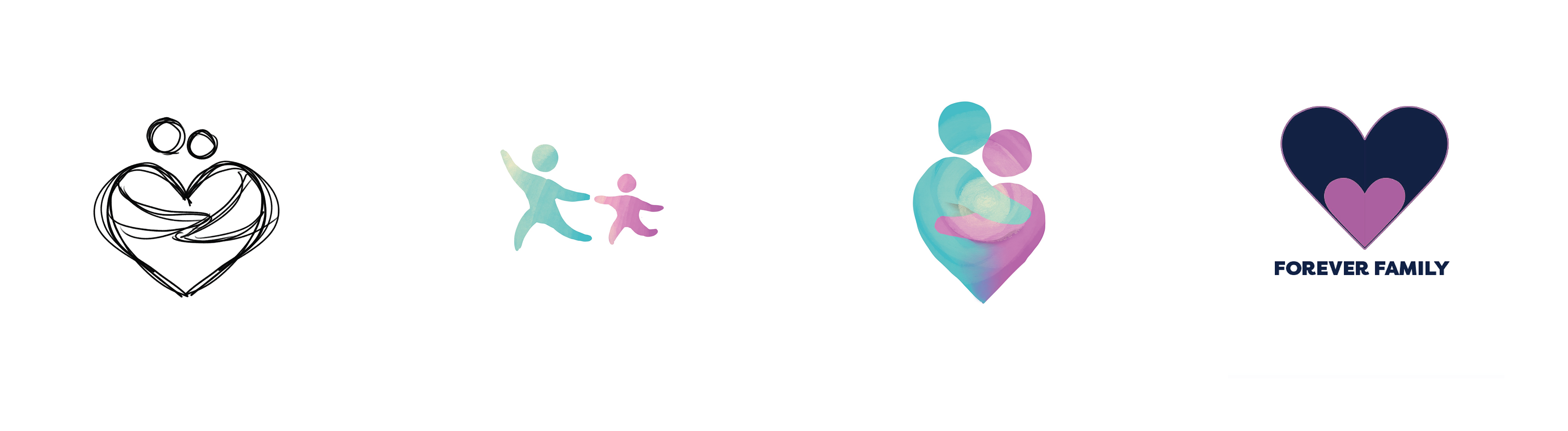
Here are our first iterations of the logo. The client was not specific about what they wanted from the logo so we decided to use some combination of figures and the heart shape. Megan designed the heart on the far right. After going to the first meeting with the clients, they told us all the designs were good! So I made vector graphics corresponding with each of the four sketches.
The team decided that the last logo was the strongest. The clients liked the first one a lot, but there was not an effective way to make it usable in all contexts.

So although we did not land on the first logo as the base, we did try to incorporate some of its features into the last logo's design.
I rounded the heart out, changed the colors, and was asked to add the word mark underneath the graphic.
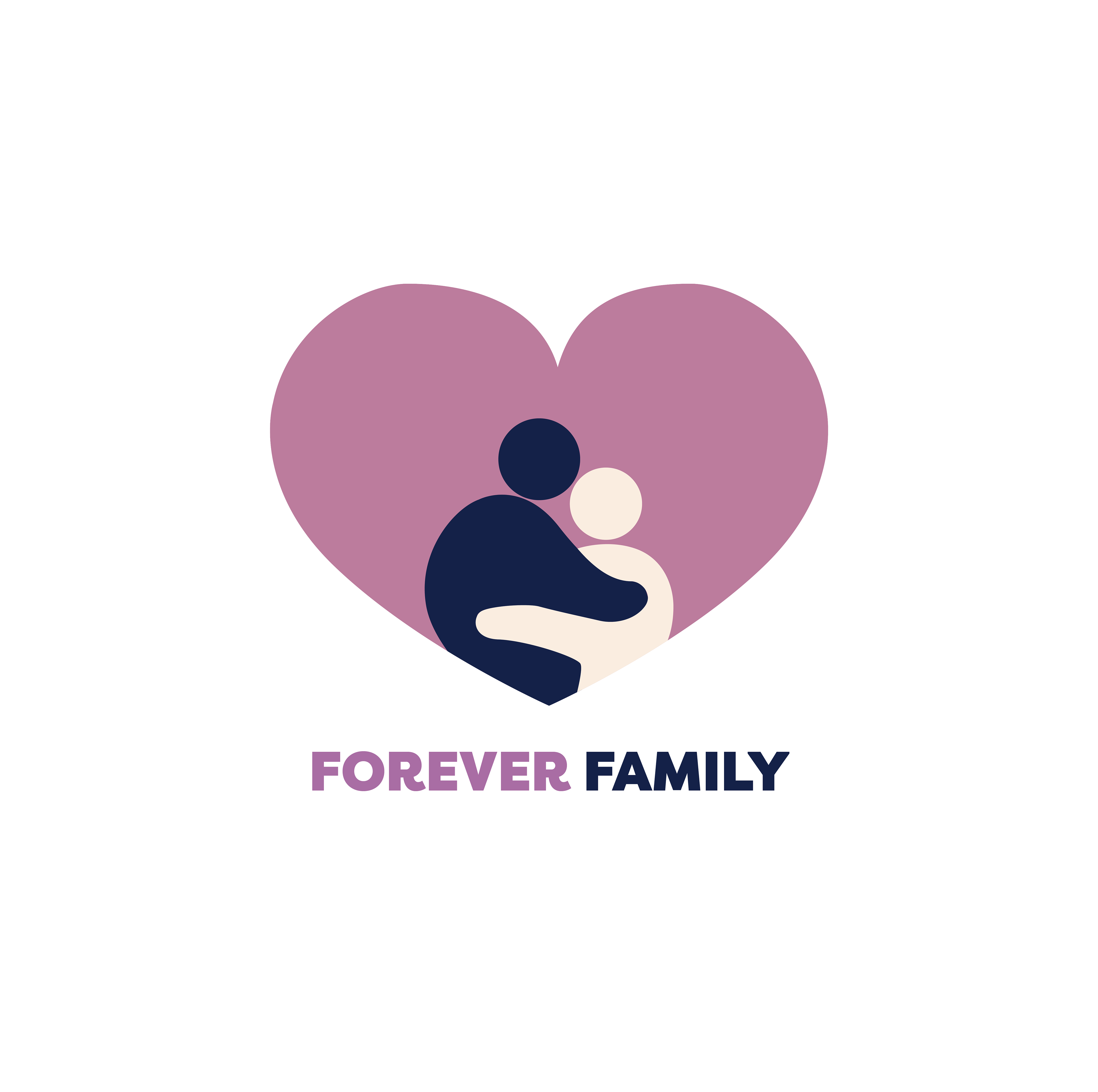
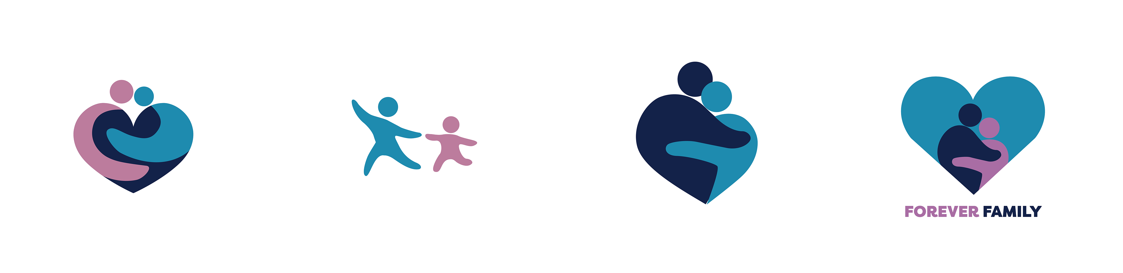
Final logo
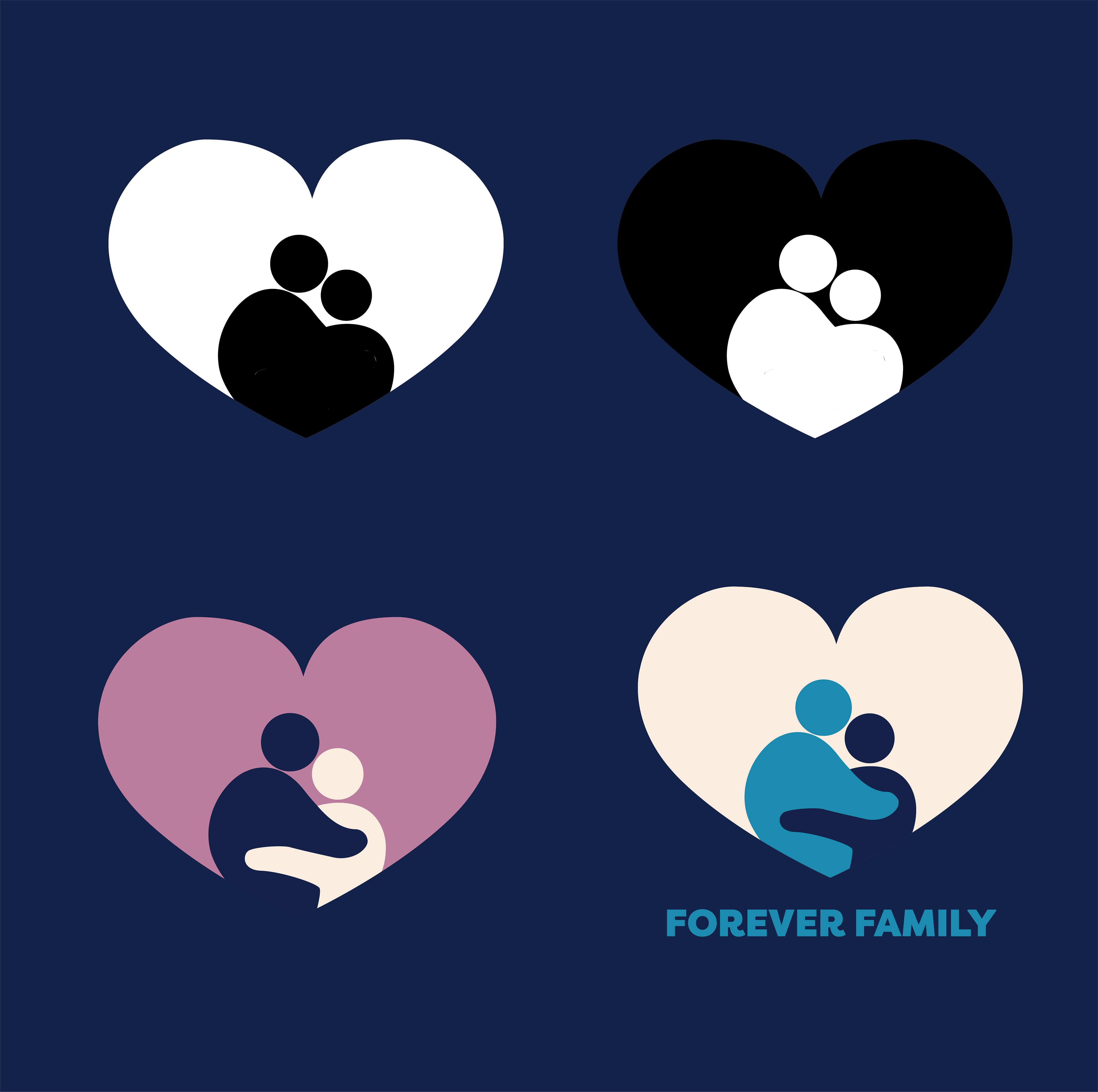
Final logo variations
With those logos on hand, we were off.
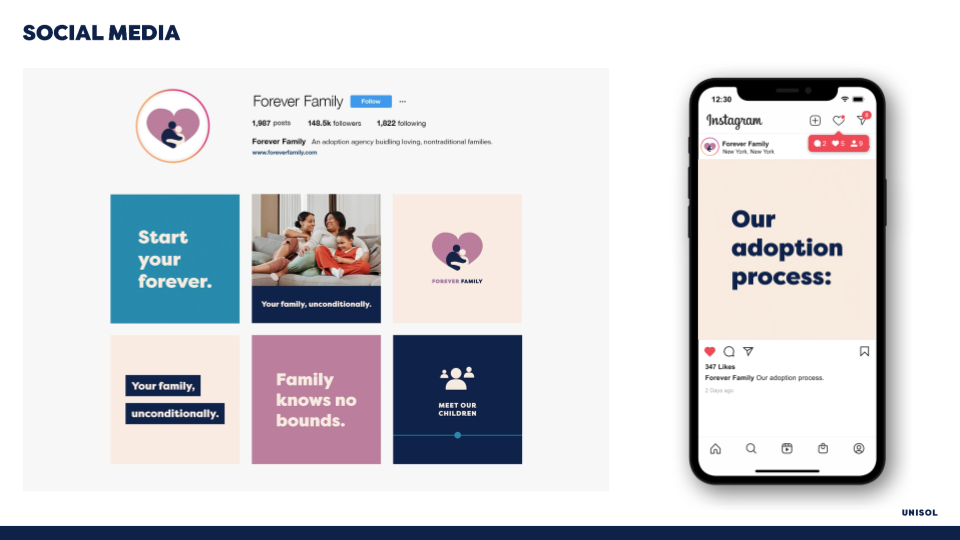
Here is a sample of some of the work done by my team.

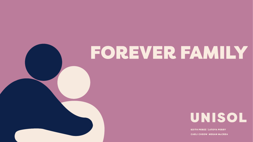
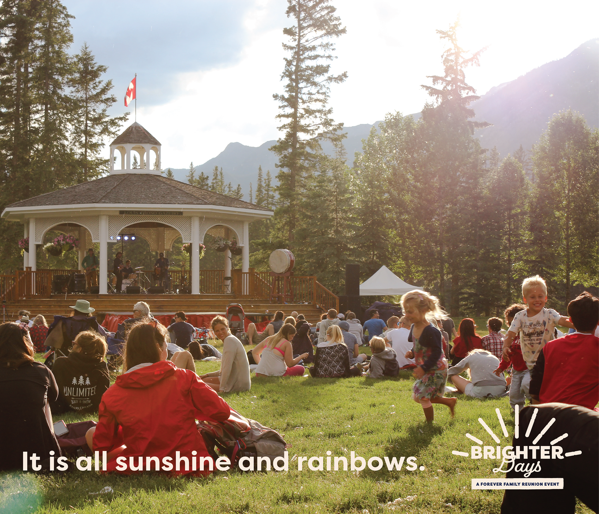
Finally, we worked on advertising for Brighter Days, the reunion event.
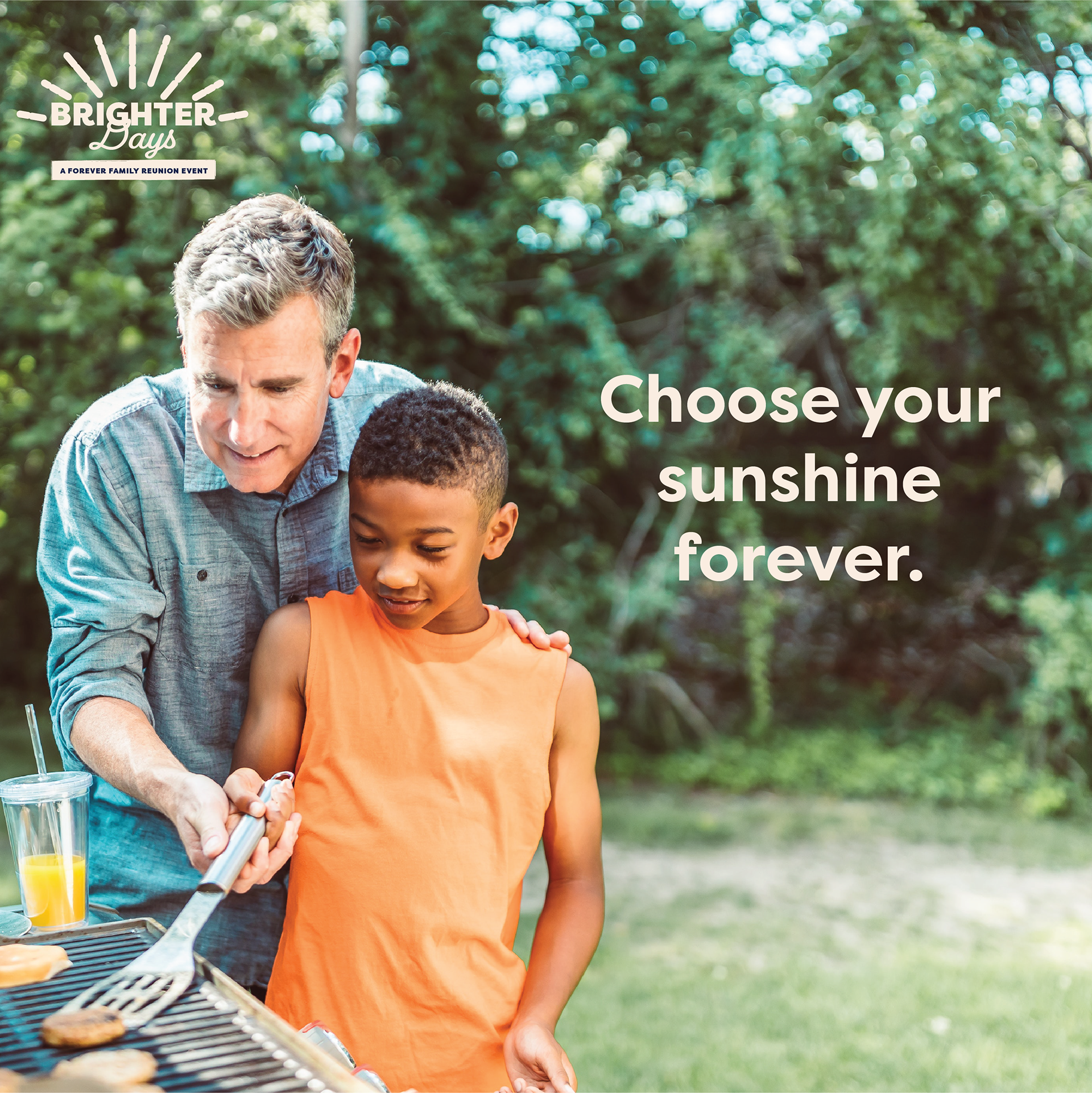
I was really proud of my team and all the good work they put in. This campaign came out really beautifully, and our clients were very happy with the results.